Useful Fundamentals for Path Tracing: Part 3
In a nutshell: “Colour” is what we characterise how our eyes react to electromagnetic radiation in the domain of visible light (380 to 780 nanometers). It is a continuous measurement, but we can transform this continuous data into 3 variables which can be converted to Red, Green and Blue values/ratios for digital images on computer screens. If we use rendering in a spectral, wavelength dependent domain we can achieve high quality renderings that can capture real-life metamerisms, more so than using an RGB colour space.
Colour Representation in Path Tracing
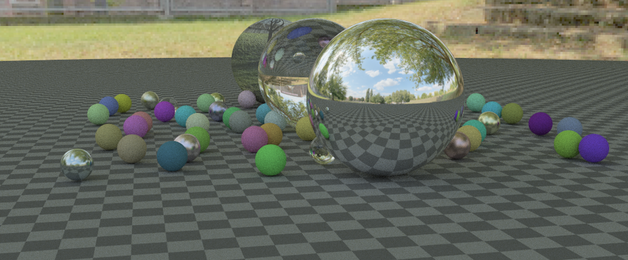
In this post, we will take a bit of a detour from the Monte Carlo methods in the previous post. Instead, we’ll have a look at how we can physically generate colour in path tracing. We sort of glossed over the importance of the wavelength in the earlier sections but actually elements such as the BRDF, transmittance, emission and even modelling camera responsivity are dependent on wavelength. If we were to model wavelength dependency in rendering we arrive at images with more accurate colour representation.
So far in our investigation of light transport for path tracing, we have seen photon models, Monte Carlo methods to sample light paths, but we haven’t discussed where the actual colour is derived from. Of course, from a CG pipeline perspective, colour is usually provided by texture maps from artists, but in the context of simulating realistic light transport in a renderer it is not as straight-forward. A simplified approximation of colour can indeed be achieved by simulating 3 discrete wavelengths (for red, green and blue) along the path space, which is what most production renderers do. Although admittedly even when simulating the wavelength domain, we typically only assume elastic scattering so the energy of the photons will stay the same after an event. This means that a photon can still be absorbed or scattered into a different direction, but we are not going to model inter-wavelength transport, although for fluorescence or phosphorescence, this would be required. Again, we have already established that this isn’t currently something that is often required in production scenarios, so it honestly is not a big deal to not model fluorescence or phosphorescence.
Before we go any further, let’s take a bit of time to quickly recap some basics on colour science, as some foundational knowledge is really important to what we are trying to achieve. We can define colour science as a blend of physical measurements and a characterisation of the human visual system.
Electromagnetic Spectrum
So visible light which you and I see, is measured by its wavelength. It is part of the electromagnetic spectrum which covers radio waves to UV rays, to gamma rays. Visible light is actually only a tiny tiny slice of the spectrum, between 380-780nm. So even though there is all this radiation transmitting/bouncing off of surfaces in the real world all the time, we only perceive a very small amount of it through our eyes. So basically, longer wavelengths appear “red” to us, medium waves look “green” and short wavelengths appear “blue”. Remember this means light in real-life is spectral, it is a continuous wave and not distinct RGB values. Let’s now recap how we go from continuous spectral data to distinct RGB values which we are more familiar with.
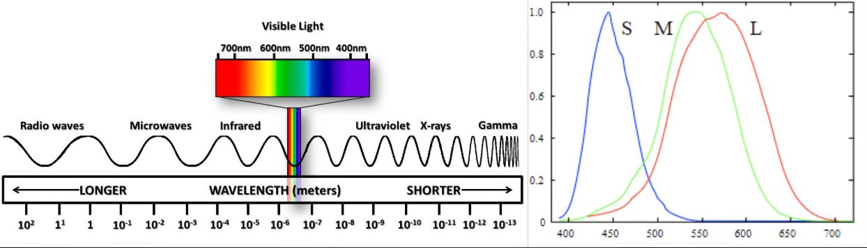
In a rather simple explanation, our eyes have receptors that are particularly sensitive to three different types of wavelengths long (redder), medium (greener) and short (bluer), which is why humans can be described to be “trichromats”. I should point this is quite rare in mammals, most mammals only have 2 colour receptors (an absence in medium/green) so we are pretty lucky in this sense! Other animals have 4 receptors where they can see UV wavelengths. The mantis shrimp actually has 12!
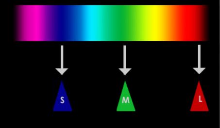
So the CIE, International Committee of Illumination did a whole bunch of tests and experiments with colour matching, and essentially they found a method to convert continuous spectral data (visible light wavelengths) to 3 variables of \(XYZ\). \(XYZ\) itself doesn’t related directly to red, green or blue, it’s more a method for differentiating between different spectral energy distributions. But, we can normalise the \(XYZ\) components and separate out the ”\(Y\)” component which represents luminance. So if we normalise these values and plot them on a graph we get the spectral locus!
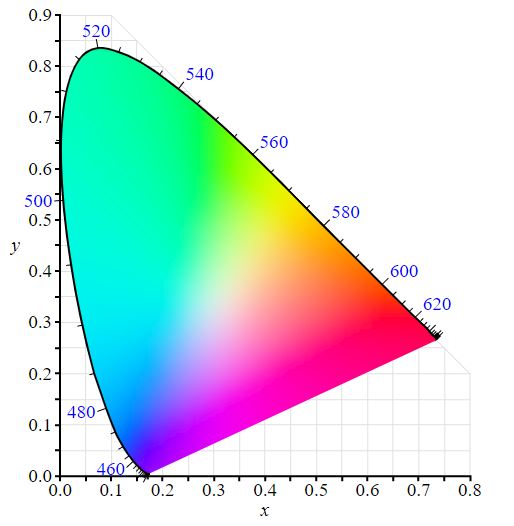
Probably we’ve all seen the spectral locus before, right? What this represents is all the possible chromas that can be expressed in visible light to us humans, all the reds, greens, blues and everything inbetween. Okay, so we’ve gone from continuous spectral visible light, to \(XYZ\) and now to an \(xyY\) model. In the spectral locus, to navigate it, we will use \(x\) and \(y\) as 2D coordinates, and \(Y\) is usually a normalised valued in this context. Here’s the final step to create distinct RGB colour space- We just need to pick 4 coordinates! One to represent Red, one for Green and one for Blue. Finally we pick a value to represent our whitepoint.
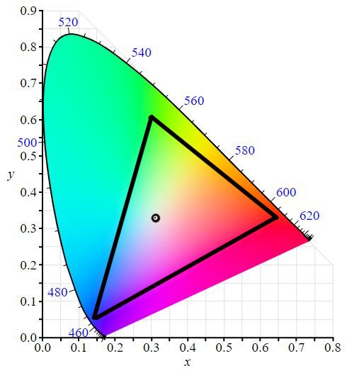
So, this is sRGB! The most commonly support colour space. The whitepoint is D65 which has a slight blueish hue to it which is well suited for office/illuminated viewing environments. This is standard for internet, displays and SDR television. So this is all good and well, but remember the spectral locus represents ALL the colours we are capable of perceiving. sRGB doesn’t cover nearly all the colours we are able to see in real-life.

DCI-P3 is the standard colour space for digital cinema, and allows for much richer reds and greens. So hopefully now, when you think of wide colour gamut, you can see it essentially just means we are making a bigger triangle. Now that wider colour gamuts are becoming more common for home computers, more and more monitors are displaying the DCI-P3 gamut, but using an alternative whitepoint of D65 (same as sRGB/Rec. 709) instead of DCI Apple uses the term Display-P3.

So another important colour space relevant to rendering right now is Rec. 2020 which seems to be the standard colour space for HDR displays. At the moment, no TVs can fully represent 100% of Rec. 2020’s colour gamut so typically for Netflix and Amazon, they expect deliverables to be mastered in DCI-P3, but delivered in Rec. 2020 as a container space. If it is preferable to rendering an RGB space instead of spectral domain, it is useful as a good rendering colour space too, since its wide gamut without any imaginary numbers and not too far off from the results one would find in a spectral rendering system..
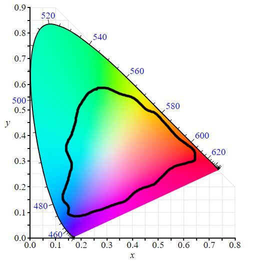
One last colour space I want to cover is Pointer’s Gamut. This is a bit different from the others because its not a regular colour space bounded by 4 values (RGB and whitepoint). It is a colour gamut that is created from taking many samples of real-life objects and their colour values. Pointers Gamut represents all the colours found in the natural world. So for artists, we want to make sure for natural objects, we keep them within the bounds of Pointers Gamut when working in wider colour spaces to prevent greens, reds and blues from looking too “fake” and “unnatural”. Of course, neon lights and more man-made objects can of course fall anywhere in the visible spectrum.
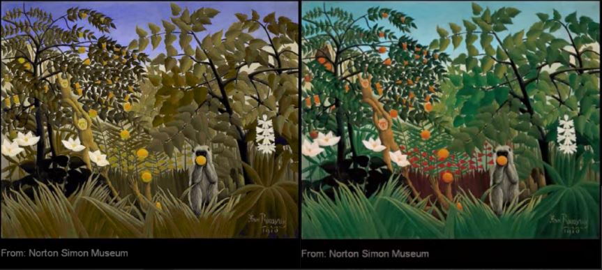
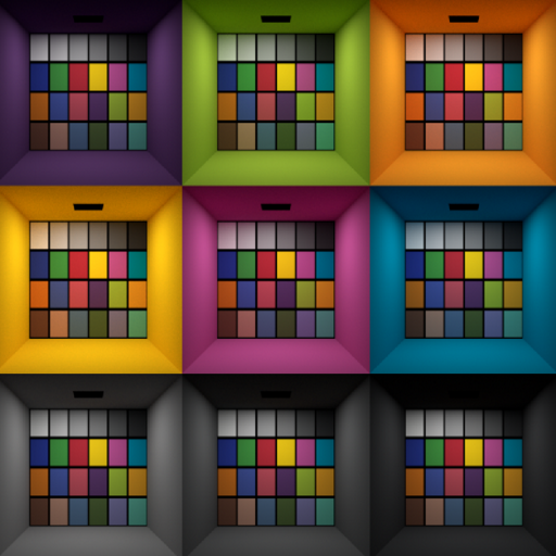
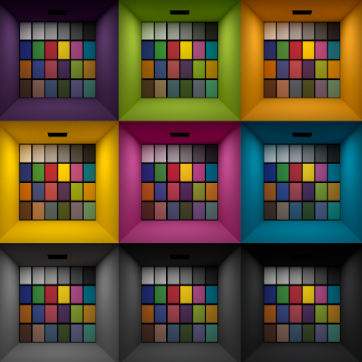
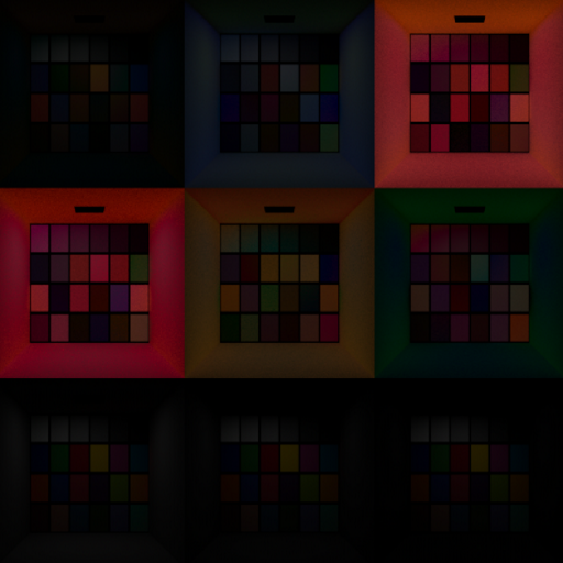
To demonstrate how rendering in a spectral domain can improve colour representation in physically based rendering, here’s a test Anders Langlands did some years back to evaluate rendering colour spaces. The examples I’ll use are sRGB and spectral, and finally the difference *2. Though please note Anders Langands did test other spaces as well. The key difference here is in the indirect illumination (GI) and how differently the results occur, especially in yellow-orange colours.
Back to Path Tracing
Okay, there’s our recap of colour science in the context of computer graphics! Please note that this was not a comprehensive look at colour science, a lot of information has been skipped in the interest of staying on topic of path tracing! So for path tracing, in the most simplest case, colour can be treated as being completely detached from path sampling. This means the path is constructed and then based on the BSDFs, we multiply colour into it. In RGB light transport, we will use CIE RGB values and evaluate for 3 distinct wavelengths, for red, green and blue approximations. Just like in the above information on colour science, these distinct values could be derived from additive RGB colour spaces such as sRGB/Rec. 709, DCI-P3/Display-P3 or Rec. 2020. Although by limiting our calculation to distinct additive RGB values, it is clear that a lot of information of the light transport must be lost between these wavelengths, since it is simply never calculated (As shown in the example above). Generally speaking for lighting artists in a production scenario, where they may often be required to break physical plausibility to achieve creative and storytelling notes anyway, this isn’t a huge issue. Given the time and resource constraints of productions, it is often better to have something that is predictable, fast and “good enough”, as opposed to something that is totally physically correct, but unpredictable and time-consuming to work with. However it is important to note that using an RGB approximation to compute light transport will yield non-physical results, and especially in the indirect illumination, its just that artists will usually accept this slight inaccuracy in favour of faster iteration times and more creative control. Perhaps in the future, the industry will widely adopt spectral rendering. For now though, having generally predictable “near-enough” RGB colour representation seems well suited for the demands on the industry.
However, if our goal is really near-perfect photorealistic light simulation from a colour reproduction perspective, this is actually quite simple (though admittedly computationally expensive) to achieve by rendering in a spectral domain. We just have to model the light source emission, the surface reflection and camera responsivity with measured spectral data, and the result will be correct. Once we have this spectral data, we can transform it into \(XYZ\) space, and then to our output display colour space, such as Rec. 2020. Modelling the spectral camera response can be especially useful for matching metamerisms of real cameras (such as matching the same imaging qualities of an Arri Alexa, with slightly green hue in the shadows). This is of course desirable for photorealistic visual effects or digital imaging but can be a limiting factor for artistic demands of highly saturated feature animation productions.
When spectral rendering is combined with realistic modelling of surface reflection, we have a natural restriction whereby light reflected cannot be brighter than its incoming source, which avoids unrealistically bright or glowing surfaces. This leads to not only better colour rendering, but also much more true-to-life global illumination. Using spectral rendering to simulate fluorescence could be beneficial for very bright and highly saturated colours. This could be advantageous for projects that rely on highly saturated and vibrant colours (though one would need to very carefully handle gamut mapping!).
In terms of actually acquiring spectral data to use, this can be acquired from a number of sources. Camera or light manufacturers may provide spectral definitions of spectral power distributions for their products. Specialist academic papers for melanin values, haemoglobin can provide spectral representations for hair and skin. However, for production we of course rely on artist-generated texture maps. It doesn’t make sense for artists to paint bitmaps in a spectral domain, nor feed in a table of wavelength intensities; additive RGB colour spaces are much more intuitive, and probably what the artist will be most familiar with (using software packages such as Mari or Substance Painter). So this means we need some kind of process where the RGB tristimulus values are upsampled into a spectral domain, although more sophisticated methods are required to avoid perfectly smooth spectra.
Using a spectral form of rendering makes it much easier to model complex effects seen in real-life such as dispersion, Rayleigh scattering and modelling sub-surface scattering. A cool thing about skin in real-life is that red light tends to travel further than blue which is why black-and-white photography shot with a red filter tends to look smoother. This is something that we can mimic really well with spectral rendering that is a bit trickier with RGB rendering.
Okay, that’s it for this post! In the spirit of exploring the physically based side of path tracing, hopefully this post is useful to show how we can think of “colour” as more than just a vec3 of red, green and blue floating point values multiplied into the light transport calculations at each BSDF evaluation.